


Visual Hierarchy: The Invisible Guide Behind Every Great Brand Experience
Visual hierarchy refers to the method of arranging elements to show their importance in an orderly manner. Designers structure visual characteristics to make information easily understandable for users. By placing elements logically and strategically, designers guide users to take desired actions.
It’s the visual hierarchy that determines how the experience is delivered. If you can’t quickly determine where to look, there is are high chance that the page layout lacks a strong visual hierarchy. Most of the time, the distinction between a Web site that looks professional and one that doesn’t has nothing to do with fancy graphics or expensive photography. At the end of the day, it’s all about creating a good visual hierarchy. So, whether you are designing a logo, marketing collateral, or social media design for your brand, you can enhance the quality of your branding by using visual hierarchy effectively.
A visual hierarchy arranges content so that it directs the eye where to go first and in what order. It’s something that can make your website or design memorable or instantly forgettable. Your potential customers are bombarded with visual content they can’t possibly process at all times. They’re swiping faster than ever, and they make a split-second decision if your brand is worth their attention, let alone money.
Core Elements of Visual Hierarchy
Size and Scale

It’s human nature that we pay more attention to bigger things. We instinctively associate a larger size with greater importance and often overlook more minor details. Brands can actually use the notion of visual weight in their marketing to shape their content in a way that helps with their communication objectives.
Color and Contrast
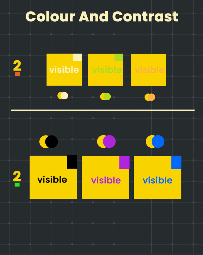
Color is not just for aesthetics; it can establish your brand’s tone, mood or meaning if applied in a strategic manner. It’s colors and contrast that our brain really focuses on when it sees a design. These elements capture attention and guide your audience exactly where you want them to look. For example, a bright orange CTA would stand out against a dark landing page background.
Typography hierarchy
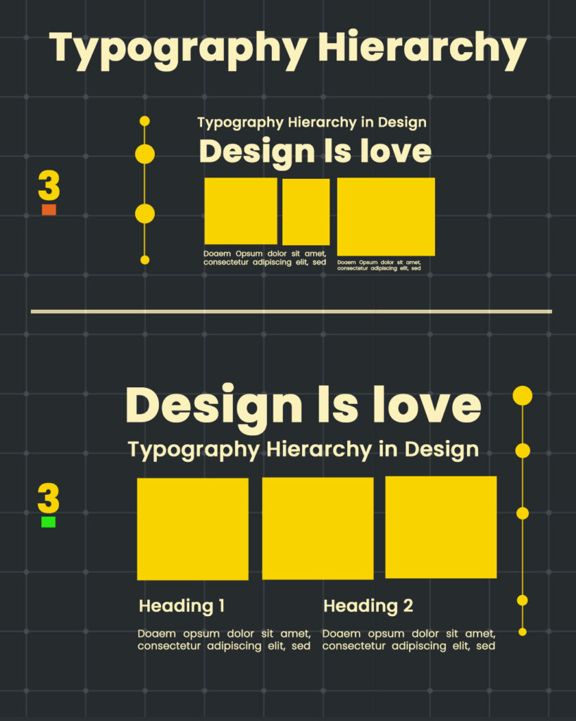
Think of typography like tone in a conversation. It tells people what to pay attention to first. Big, bold headlines are like someone speaking up in a room, while smaller text feels more like a quiet aside. When you adjust the size, weight, or style of your fonts with purpose, it helps your message flow naturally. It’s not about making things look fancy. It’s about helping your reader move through your content with ease.
Space and Layout
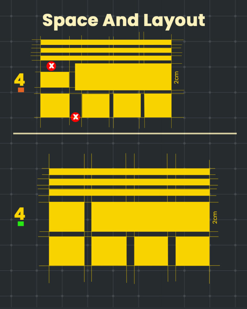
Have you ever entered a messy room and immediately felt overwhelmed? That’s the sensation we feel when designers overcrowd a design. White space is not empty or wasted; it is what gives your content breathing room. And it’s neat and helps keep your content organized, so your reader knows where to look next. It’s like setting the mood before a good conversation. You’re not just putting things down. You’re making comfort and clarity.
Bonus: The Gestalt Principles That Power Great Design
Understanding Gestalt principles gives designers a potent edge. These psychology-backed concepts explain how humans naturally interpret visual information, subtly elevating design by aligning with perception.
1. Proximity
Elements placed near each other are perceived as a group. This principle organizes content without the need for extra lines or borders. When related items are placed in proximity, that relationship becomes obvious immediately.
2. Similarity
Objects are considered to be of the same category if they have a similar shape, size, or color. When fonts, buttons, and icons are consistent, it is easier for users to find their way around without getting lost
3. Figure and Ground
Viewers automatically distinguish between subject (the figure) and background (the ground). Key content is also well-helighted with strong contrast and clear focal points leading the eye with purpose.
4. Closure
The mind completes what isn’t fully shown. Designs that include partial shapes or silhouettes can feel more dynamic yet remain recognizable.
5. Continuity
The eye prefers smooth and uniform paths. Basic visual cues, such as arrows or leading lines, can guide a user’s attention from one portion of the page to another. As you contemplate how size, contrast, typography, whitespace — and, even, Gestalt principles — work together to draw attention, remember: design isn’t just about looking good. It’s about communicating meaning.
If you’re seeking a partner who truly lives and breathes visual hierarchy and smart design, you’re in the right place. At Biztal Box, our creative agency in New Delhi crafts interfaces that feel intuitive, purposeful, and memorable—because every pixel has intent.
Also Read:- Volkswagen: Think Small — The Poster That Blew Up Advertising
Leave a Reply
Your email address will not be published. Required fields are marked *
Comments