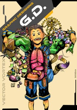
Discovery
Deep-dive into your brand, audience, competitors, and goals. We ask the questions others dont.


Nottingham is a city with genuine commercial character — a place where independent spirit, creative energy, and serious business ambition coexist in equal measure. In that environment, brands that communicate with clarity, personality, and conviction are the ones that earn loyalty, command attention, and outlast their competition. Biztalbox is the graphic design company in Nottingham that helps businesses achieve exactly that. We are not a production house that executes briefs mechanically — we are a thinking partner that challenges, interrogates, and ultimately produces visual work that changes how your audience perceives and chooses your business. Our graphic design services in Nottingham cover everything from foundational brand identity and strategic communications to social content, digital experiences, and physical design that makes a mark. Whatever your creative challenge, we are ready to meet it head-on.
HOW WE WORK
Deep-dive into your brand, audience, competitors, and goals. We ask the questions others dont.
Define positioning, messaging hierarchy, and creative direction before a single pixel is placed.
Iterative visual development with structured feedback rounds. You guide the direction - we execute it brilliantly.
Production-ready files, brand guidelines, and an ongoing support relationship — because great design is never one and done.
Great design brings together images, typography, colour, and layout to communicate ideas clearly and effectively. By thoughtfully arranging visual elements, designers create engaging experiences that guide attention and strengthen messages. The result is visual storytelling that drives connection and action.
Great design starts with 8 essential elements.
Direction is what we want the viewer to look at first. It gives the design movement and guides the eye through the composition.
Lines can be used to divide space and direct the viewer's eye. They can be used to create emphasis or movement.
Typography is the art of arranging type to make written language legible, readable and appealing when displayed.
Size is used to create emphasis or visual hierarchy.
Colour helps set the mood and tone of a design. It can be used to create contrast, emphasis and visual interest.
Value refers to the lightness or darkness of a colour. It helps create depth, contrast and visual interest in a design.

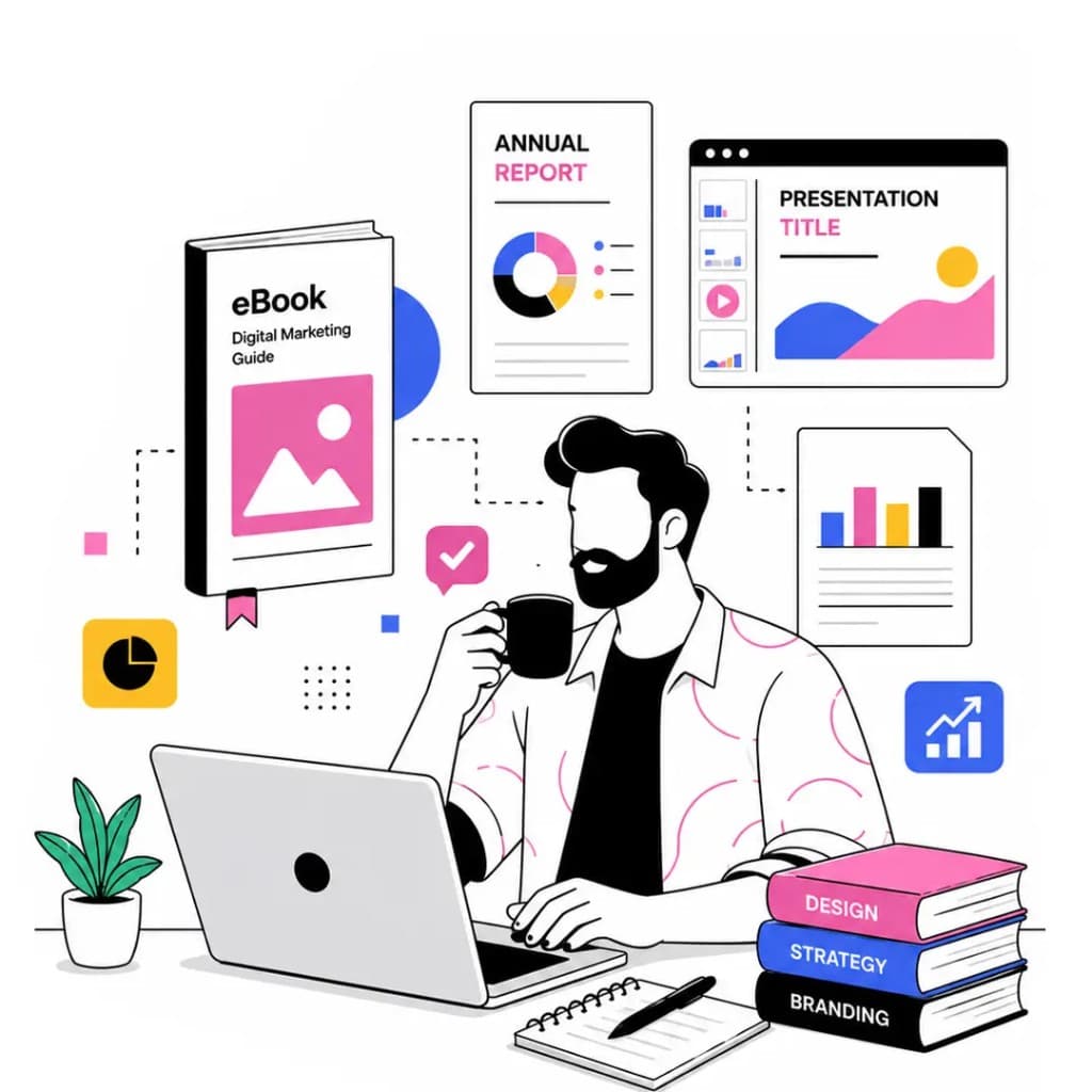
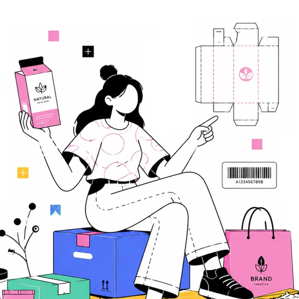
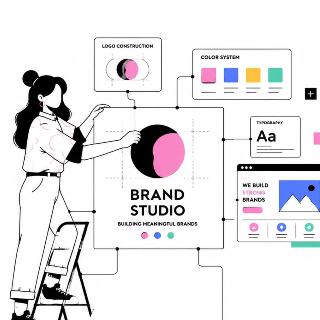
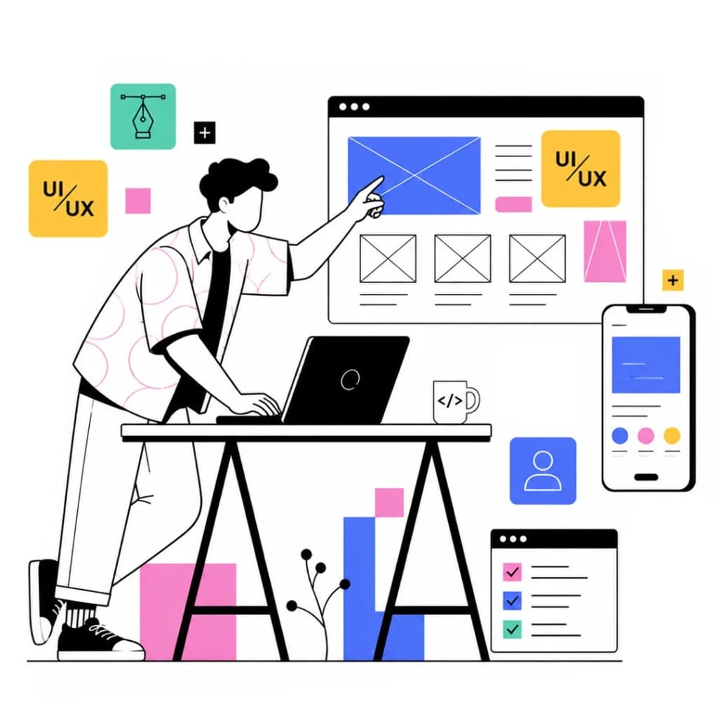
Local brand equity is genuinely valuable and should be treated with care. When a business has built real recognition in its community, the risk of a poorly handled rebrand is that it severs the emotional connection customers have with the existing identity. Our approach is to map that equity carefully before any design work begins — understanding precisely which elements of the current brand carry recognition and affection, and which are simply outdated or underperforming. We then design an evolution that preserves what matters while moving the brand forward with clarity and confidence.
Are you ready to create the perfect graphic design with us?
If you want to ask a question or speak directly to the team, please call us +91 9485699709